| Home | All Classes | Main Classes | Annotated | Grouped Classes | Functions |
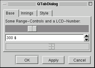
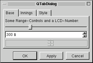
The TQTabDialog class provides a stack of tabbed widgets. More...
#include <tqtabdialog.h>
Inherits TQDialog.
The TQTabDialog class provides a stack of tabbed widgets.
A tabbed dialog is one in which several "tab pages" are available. By clicking on a tab page's tab or by pressing the indicated Alt+letter key combination, the user can select which tab page they want to use.
TQTabDialog provides a tab bar consisting of single row of tabs at the top; each tab has an associated widget which is that tab's tab page. In addition, TQTabDialog provides an OK button and the following optional buttons: Apply, Cancel, Defaults and Help.
The normal way to use TQTabDialog is to do the following in the constructor:
If you don't call addTab() the page you have created will not be visible. Don't confuse the object name you supply to the TQWidget constructor and the tab label you supply to addTab(); addTab() takes user-visible name that appears on the widget's tab and may identify an accelerator, whereas the widget name is used primarily for debugging.
Almost all applications have to connect the applyButtonPressed() signal to something. applyButtonPressed() is emitted when either OK or Apply is clicked, and your slot must copy the dialog's state into the application.
There are also several other signals which may be useful:
Each tab is either enabled or disabled at any given time (see setTabEnabled()). If a tab is enabled the tab text is drawn in black and the user can select that tab. If it is disabled the tab is drawn in a different way and the user cannot select that tab. Note that even if a tab is disabled, the page can still be visible; for example, if all of the tabs happen to be disabled.
You can change a tab's label and iconset using changeTab(). A tab page can be removed with removePage() and shown with showPage(). The current page is given by currentPage().
TQTabDialog does not support tabs on the sides or bottom, nor can you set or retrieve the visible page. If you need more functionality than TQTabDialog provides, consider creating a TQDialog and using a TQTabBar with TQTabWidgets.
Most of the functionality in TQTabDialog is provided by a TQTabWidget.


See also TQDialog and Dialog Classes.
This signal is emitted by show() when it is time to set the state of the dialog's contents. The dialog should reflect the current state of the application when it appears; if there is any possibility that the state of the application may change between the time you call TQTabDialog::TQTabDialog() and TQTabDialog::show(), you should set the dialog's state in a slot and connect this signal to it.
This applies mainly to TQTabDialog objects that are kept around hidden, rather than being created, shown, and deleted afterwards.
See also applyButtonPressed(), show(), and cancelButtonPressed().
The new page is child; the tab's label is label. Note the difference between the widget name (which you supply to widget constructors and to setTabEnabled(), for example) and the tab label. The name is internal to the program and invariant, whereas the label is shown on-screen and may vary according to language and other factors.
If the tab's label contains an ampersand, the letter following the ampersand is used as an accelerator for the tab, e.g. if the label is "Bro&wse" then Alt+W becomes an accelerator which will move the focus to this tab.
If you call addTab() after show() the screen will flicker and the user may be confused.
See also insertTab().
This version of the function shows the iconset as well as the label on the tab of child.
This is a lower-level method for adding tabs, similar to the other addTab() method. It is useful if you are using setTabBar() to set a TQTabBar subclass with an overridden TQTabBar::paint() function for a subclass of TQTab.
The child is the widget to be placed on the new tab page. The tab is the tab to display on the tab page -- normally this shows a label or an icon that identifies the tab page.
This signal is emitted when either the Apply or OK button is clicked.
It should be connected to a slot (or several slots) that change the application's state according to the state of the dialog.
See also cancelButtonPressed(), defaultButtonPressed(), and setApplyButton().
This signal is emitted when the Cancel button is clicked. It is automatically connected to TQDialog::reject(), which will hide the dialog.
The Cancel button should not change the application's state at all, so you should generally not need to connect it to any slot.
See also applyButtonPressed(), defaultButtonPressed(), and setCancelButton().
Defines a new label for the tab of page w
This signal is emitted whenever the current page changes.
See also currentPage(), showPage(), and tabLabel().
This signal is emitted when the Defaults button is pressed. It should reset the dialog (but not the application) to the "factory defaults".
The application's state should not be changed until the user clicks Apply or OK.
See also applyButtonPressed(), cancelButtonPressed(), and setDefaultButton().
See also setApplyButton(), applyButtonPressed(), hasCancelButton(), and hasDefaultButton().
See also setCancelButton(), cancelButtonPressed(), hasApplyButton(), and hasDefaultButton().
See also setDefaultButton(), defaultButtonPressed(), hasApplyButton(), and hasCancelButton().
See also setHelpButton(), helpButtonPressed(), hasApplyButton(), and hasCancelButton().
See also setOkButton(), hasApplyButton(), hasCancelButton(), and hasDefaultButton().
This signal is emitted when the Help button is pressed. It could be used to present information about how to use the dialog.
See also applyButtonPressed(), cancelButtonPressed(), and setHelpButton().
The new page is child; the tab's label is label. Note the difference between the widget name (which you supply to widget constructors and to setTabEnabled(), for example) and the tab label. The name is internal to the program and invariant, whereas the label is shown on-screen and may vary according to language and other factors.
If the tab's label contains an ampersand, the letter following the ampersand is used as an accelerator for the tab, e.g. if the label is "Bro&wse" then Alt+W becomes an accelerator which will move the focus to this tab.
If index is not specified, the tab is simply added. Otherwise it is inserted at the specified position.
If you call insertTab() after show(), the screen will flicker and the user may be confused.
See also addTab().
This version of the function shows the iconset as well as the label on the tab of child.
This is a lower-level method for inserting tabs, similar to the other insertTab() method. It is useful if you are using setTabBar() to set a TQTabBar subclass with an overridden TQTabBar::paint() function for a subclass of TQTab.
The child is the widget to be placed on the new tab page. The tab is the tab to display on the tab page -- normally this shows a label or an icon that identifies the tab page. The index is the position where this tab page should be inserted.
See also setTabEnabled() and TQWidget::enabled.
Returns TRUE if the page with object name name is enabled and FALSE if it is disabled.
If name is 0 or not the name of any of the pages, isTabEnabled() returns FALSE.
See also setTabEnabled() and TQWidget::enabled.
See also showPage(), TQTabWidget::removePage(), and TQWidgetStack::removeWidget().
This signal is emitted whenever a tab is selected (raised), including during the first show().
See also raise().
The Apply button should apply the current settings in the dialog box to the application while keeping the dialog visible.
When Apply is clicked, the applyButtonPressed() signal is emitted.
If text is a null string, no button is shown.
See also setCancelButton(), setDefaultButton(), and applyButtonPressed().
Adds an Apply button to the dialog. The button's text is set to a localizable "Apply".
The cancel button should always return the application to the state it was in before the tab view popped up, or if the user has clicked Apply, back to the state immediately after the last Apply.
When Cancel is clicked, the cancelButtonPressed() signal is emitted. The dialog is closed at the same time.
If text is a null string, no button is shown.
See also setApplyButton(), setDefaultButton(), and cancelButtonPressed().
Adds a Cancel button to the dialog. The button's text is set to a localizable "Cancel".
The Defaults button should set the dialog (but not the application) back to the application defaults.
When Defaults is clicked, the defaultButtonPressed() signal is emitted.
If text is a null string, no button is shown.
See also setApplyButton(), setCancelButton(), and defaultButtonPressed().
Adds a Defaults button to the dialog. The button's text is set to a localizable "Defaults".
If the widget is visible, the display is updated with the new font immediately. There may be some geometry changes, depending on the size of the old and new fonts.
Reimplemented from TQWidget.
When Help is clicked, the helpButtonPressed() signal is emitted.
If text is a null string, no button is shown.
See also setApplyButton(), setCancelButton(), and helpButtonPressed().
Adds a Help button to the dialog. The button's text is set to a localizable "Help".
When the OK button is clicked, the applyButtonPressed() signal is emitted, and the current settings in the dialog box should be applied to the application. The dialog then closes.
If text is a null string, no button is shown.
See also setCancelButton(), setDefaultButton(), and applyButtonPressed().
Adds an OK button to the dialog. The button's text is set to a localizable "OK".
See also tabBar().
TQTabWidget uses TQWidget::setEnabled() internally, rather than keeping a separate flag.
Note that even a disabled tab and tab page may be visible. If the page is already visible TQTabWidget will not hide it; if all the pages are disabled TQTabWidget will show one of them.
See also isTabEnabled() and TQWidget::enabled.
Finds the page with object name name, enables/disables it according to the value of enable and redraws the page's tab appropriately.
TQTabDialog uses TQWidget::setEnabled() internally, rather than keeping a separate flag.
Note that even a disabled tab/page may be visible. If the page is already visible TQTabDialog will not hide it; if all the pages are disabled TQTabDialog will show one of them.
The object name is used (rather than the tab label) because the tab text may not be invariant in multi-language applications.
See also isTabEnabled() and TQWidget::enabled.
Warning: If used carelessly, this function can easily surprise or confuse the user.
See also TQTabBar::currentTab.
See also setTabBar().
This file is part of the TQt toolkit. Copyright © 1995-2007 Trolltech. All Rights Reserved.
| Copyright © 2007 Trolltech | Trademarks | TQt 3.3.8
|