TQCheckListItem Class Reference
The TQCheckListItem class provides checkable list view items.
More...
#include <ntqlistview.h>
Inherits TQListViewItem.
List of all member functions.
Public Members
- enum Type { RadioButton, CheckBox, Controller, RadioButtonController = Controller, CheckBoxController }
- enum ToggleState { Off, NoChange, On }
- TQCheckListItem ( TQCheckListItem * parent, const TQString & text, Type tt = RadioButtonController )
- TQCheckListItem ( TQCheckListItem * parent, TQListViewItem * after, const TQString & text, Type tt = RadioButtonController )
- TQCheckListItem ( TQListViewItem * parent, const TQString & text, Type tt = RadioButtonController )
- TQCheckListItem ( TQListViewItem * parent, TQListViewItem * after, const TQString & text, Type tt = RadioButtonController )
- TQCheckListItem ( TQListView * parent, const TQString & text, Type tt = RadioButtonController )
- TQCheckListItem ( TQListView * parent, TQListViewItem * after, const TQString & text, Type tt = RadioButtonController )
- TQCheckListItem ( TQListViewItem * parent, const TQString & text, const TQPixmap & p )
- TQCheckListItem ( TQListView * parent, const TQString & text, const TQPixmap & p )
- ~TQCheckListItem ()
- virtual void paintCell ( TQPainter * p, const TQColorGroup & cg, int column, int width, int align )
- virtual void paintFocus ( TQPainter * p, const TQColorGroup & cg, const TQRect & r )
- virtual void setOn ( bool b )
- bool isOn () const
- Type type () const
- TQString text () const
- void setTristate ( bool b )
- bool isTristate () const
- ToggleState state () const
- void setState ( ToggleState s )
- virtual int rtti () const
Protected Members
Detailed Description
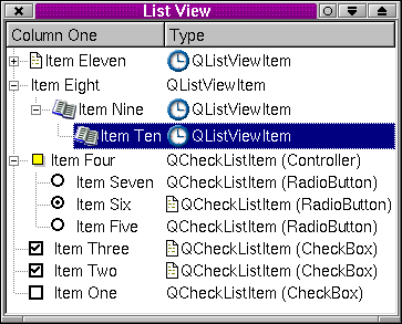
The TQCheckListItem class provides checkable list view items.
TQCheckListItems are used in TQListViews to provide
TQListViewItems that are checkboxes, radio buttons or
controllers.
Checkbox and controller check list items may be inserted at any
level in a list view. Radio button check list items must be
children of a controller check list item.
The item can be checked or unchecked with setOn(). Its type can be
retrieved with type() and its text retrieved with text().

See also TQListViewItem, TQListView, and Advanced Widgets.
Member Type Documentation
TQCheckListItem::ToggleState
This enum specifies a TQCheckListItem's toggle state.
- TQCheckListItem::Off
- TQCheckListItem::NoChange
- TQCheckListItem::On
TQCheckListItem::Type
This enum type specifies a TQCheckListItem's type:
- TQCheckListItem::RadioButton
- TQCheckListItem::CheckBox
- TQCheckListItem::Controller - obsolete (use RadioButtonController instead)
- TQCheckListItem::RadioButtonController
- TQCheckListItem::CheckBoxController
Member Function Documentation
TQCheckListItem::TQCheckListItem ( TQCheckListItem * parent, const TQString & text, Type tt = RadioButtonController )
Constructs a checkable item with parent parent, text text
and of type tt. Note that a RadioButton must be the child of a
RadioButtonController, otherwise it will not toggle.
TQCheckListItem::TQCheckListItem ( TQCheckListItem * parent, TQListViewItem * after, const TQString & text, Type tt = RadioButtonController )
Constructs a checkable item with parent parent, which is after
after in the parent's list of children, and with text text
and of type tt. Note that a RadioButton must be the child of
a RadioButtonController, otherwise it will not toggle.
TQCheckListItem::TQCheckListItem ( TQListViewItem * parent, const TQString & text, Type tt = RadioButtonController )
Constructs a checkable item with parent parent, text text
and of type tt. Note that this item must not be a RadioButton. Radio buttons must be children of a RadioButtonController.
TQCheckListItem::TQCheckListItem ( TQListViewItem * parent, TQListViewItem * after, const TQString & text, Type tt = RadioButtonController )
Constructs a checkable item with parent parent, which is after
after in the parent's list of children, with text text and
of type tt. Note that this item must not be a RadioButton. Radio buttons must be children of a RadioButtonController.
TQCheckListItem::TQCheckListItem ( TQListView * parent, const TQString & text, Type tt = RadioButtonController )
Constructs a checkable item with parent parent, text text
and of type tt. Note that tt must not be RadioButton.
Radio buttons must be children of a RadioButtonController.
TQCheckListItem::TQCheckListItem ( TQListView * parent, TQListViewItem * after, const TQString & text, Type tt = RadioButtonController )
Constructs a checkable item with parent parent, which is after
after in the parent's list of children, with text text and
of type tt. Note that tt must not be RadioButton.
Radio buttons must be children of a RadioButtonController.
TQCheckListItem::TQCheckListItem ( TQListViewItem * parent, const TQString & text, const TQPixmap & p )
Constructs a RadioButtonController item with parent parent,
text text and pixmap p.
TQCheckListItem::TQCheckListItem ( TQListView * parent, const TQString & text, const TQPixmap & p )
Constructs a RadioButtonController item with parent parent,
text text and pixmap p.
TQCheckListItem::~TQCheckListItem ()
Destroys the item, and all its children to any depth, freeing up
all allocated resources.
void TQCheckListItem::activate () [virtual protected]
Toggle check box or set radio button to on.
Reimplemented from TQListViewItem.
bool TQCheckListItem::isOn () const
Returns TRUE if the item is toggled on; otherwise returns FALSE.
bool TQCheckListItem::isTristate () const
Returns TRUE if the item is tristate; otherwise returns FALSE.
See also setTristate().
void TQCheckListItem::paintCell ( TQPainter * p, const TQColorGroup & cg, int column, int width, int align ) [virtual]
Paints the item using the painter p and the color group cg.
The item is in column column, has width width and has
alignment align. (See TQt::AlignmentFlags for valid alignments.)
Reimplemented from TQListViewItem.
void TQCheckListItem::paintFocus ( TQPainter * p, const TQColorGroup & cg, const TQRect & r ) [virtual]
Draws the focus rectangle r using the color group cg on the
painter p.
Reimplemented from TQListViewItem.
int TQCheckListItem::rtti () const [virtual]
Returns 1.
Make your derived classes return their own values for rtti(), and
you can distinguish between list view items. You should use values
greater than 1000, to allow for extensions to this class.
Reimplemented from TQListViewItem.
void TQCheckListItem::setOn ( bool b ) [virtual]
Sets the button on if b is TRUE, otherwise sets it off.
Maintains radio button exclusivity.
void TQCheckListItem::setState ( ToggleState s )
Sets the toggle state of the checklistitem to s. s can be
Off, NoChange or On.
Tristate can only be enabled for CheckBox or CheckBoxController,
therefore the NoChange only applies to them.
Setting the state to On or Off on a CheckBoxController
will recursivly set the states of its children to the same state.
Setting the state to NoChange on a CheckBoxController will
make it recursivly recall the previous stored state of its
children. If there was no previous stored state the children are
all set to On.
void TQCheckListItem::setTristate ( bool b )
Sets tristate to b if the Type is either a CheckBoxController or
a CheckBox.
CheckBoxControllers are tristate by default.
See also state() and isTristate().
ToggleState TQCheckListItem::state () const
Returns the state of the item.
See also TQCheckListItem::ToggleState.
void TQCheckListItem::stateChange ( bool ) [virtual protected]
This virtual function is called when the item changes its state.
NoChange (if tristate is enabled and the type is either CheckBox or CheckBoxController) reports the same as Off, so
use state() to determine if the state is actually Off or NoChange.
TQString TQCheckListItem::text () const
Returns the item's text.
void TQCheckListItem::turnOffChild () [protected]
If this is a RadioButtonController that has RadioButton
children, turn off the child that is on.
Type TQCheckListItem::type () const
Returns the type of this item.
This file is part of the TQt toolkit.
Copyright © 1995-2007
Trolltech. All Rights Reserved.
